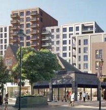
The council is consulting on how new buildings should appear, by creating an Urban Planning Guide for architects. Most of this document is good, there are only… the illustrations. These are nearly all cheap, ugly, and very undesirable. Including these will make it very hard to object to schemes like the brutalist-car-park design for Churchill Quarter, because they look just like what the council has used as best-example illustrations!

We would like to see these examples removed and replaced:
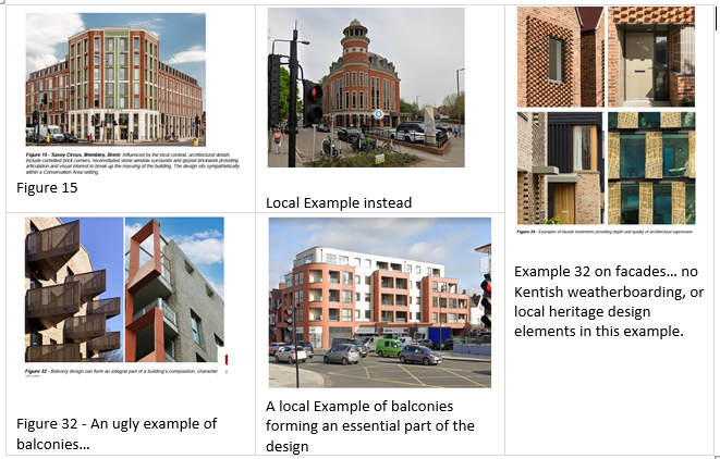
- Figures 14, 16, 17, and 18. Examples of buildings that are too tall for anywhere in the borough (and the ‘decorative’ ones fail to use any good local examples or heritage features – brutalist balconies and random brick ends are not what we want to see in Bromley)
- Figures 15, 32, 34. Poor choice of decorative features – especially balconies (no heritage features) – and failing to use good local examples. Sticking brick ends out of a wall is not depth and quality – try ‘vernacular’ features such as Kentish hung tiles and black weatherboarding
- Figures 6, 23 and 25. These do demonstrate new buildings at a ‘human scale’ and ‘conformable’ to existing low level development, but… they are cheapskate, plain, short on windows and heritage features are completely absent. Use Trinity Village or the Bromley Hospital site developments, they are both better than these.
- Figures 30, 31, 32. These ignore local heritage and take the cheapest interpretation of the 1960s. Appropriate for the Hayesford Park estate, but not suitable for a borough-wide guide.
It is late to object (as the author is not a planner and has a job to earn a living) but you can still write to ldf@bromley.gov.uk. Please cc your email to us at chair@bromleycivicsociety.org.uk, and to the town centre councillors at btcouncillors@bromleylibdems.org.uk. You can write to Head of Planning Policy and Strategy, London Borough of Bromley, Civic Centre, Stockwell Close, Bromley BR1 3UH.
Additionally, we would encourage you to endorse these comments by the chair of the Bromley Civic Society:
- Section 3 p.8 et seq –Make a greater emphasis importance of trees and leafy avenues as that is an important characteristic of suburban Bromley
- Para 5.7 and 5.10. – Change to say that Heritage Assets DO make a significant contribution (instead of can) and replace ‘several’ statutory listed buildings with ‘many’.
- Draw attention to the Historic England guidence notes to help developer work in a heritage context, as these are mostly missed by applicants
In summary, our Chair says “Although intended to show specific situations the overall impression of chosen examples is a bland, one style of architecture seen everywhere today and based on cost effectiveness and formulaic solutions. In the context of an SPD (what this document forms part of) these examples are in danger of being interpreted by developers as the Council’s ideal rather than the SPD promoting innovation and response to context which the written document sets out to promote quite successfully. This kind of problem became apparent a few years ago with the CABE building formula of grey metal and terracotta cladding which now look absurdly dated and has been abandoned as an architectural style… photo examples might show development in the Bromley Borough where new development clearly has responded to context” (see pdf link at the bottom)

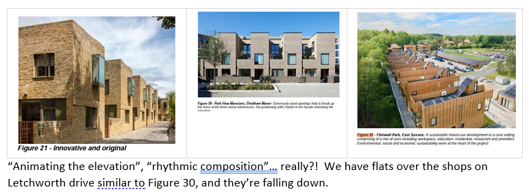
Again, Trinity Village has more appropriate examples than this; and for mixed-type developments, the old Paper Mill site at South Darenth is much more attractive.

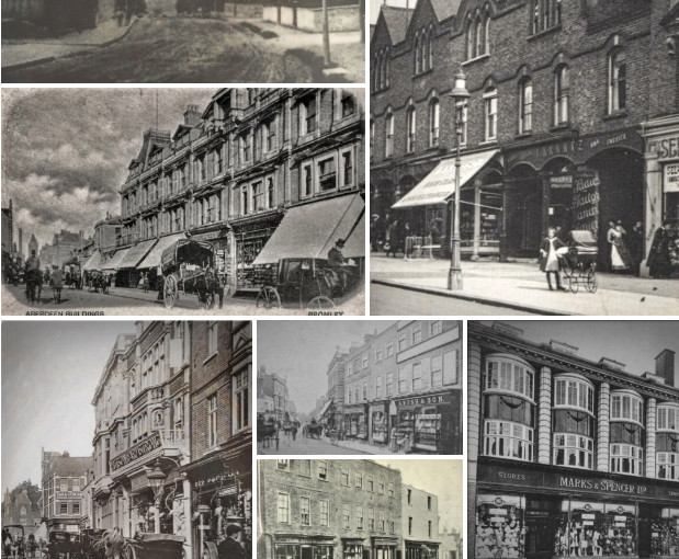 Browse our old photos, in
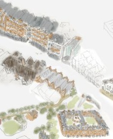
  from being dominated by tower blocks: Look here and email our ward councillors about:
*